Thursday, June 30, 2022

Finally, cards for the Americans!

 As I have documented before, the Nets are my favorite team in the NBA, and they also started back in the ABA days...as the New York Americans, a moniker they carried for only one year. They changed to the Nets simply because it rhymed with Mets and Jets, two established New York sports teams. 


However, the early days of the ABA are not well represented on cards. Until Topps made the choice to put them in their 1971-72 set, there was pretty much nothing for the ABA...if there were any cards they were regional issues that I am unaware of or have forgotten as I've been thinking more about models for the past three years. 

Until 2019, that is. A new company called Lana Sports issued a set of cards based on the first season of the ABA, 1967-68. All the players in the league got a card...but unfortunately they aren't photos. I saw the set's announcement and that it carried a hefty $250 per box price tag...I couldn't do it. However, in April one of my friends on the Database got his hands on a set and broke it up, and offered me the Americans, a trade I gladly made. 


Here's just a sample of them. The art...isn't great. Have to be honest, I haven't ever seen a photo of most of these guys before, but the guys I am familiar with...I recognize them, but it's like a cartoon version of them I suppose is the best way to put it. 

I don't want to sound ungrateful here, I'm very glad there is finally some recognition for the first year of "my team". I just wish they had used photos, even black and white photos. 

Many of the players in the set are appearing on cards for the first time ever. 

The cards feature an interesting texture. The card front is almost rubbery, but I like it. The backs are normal card texture, glossy but not high UV coating. No UV coating at all as far as I can tell. Speaking of the backs...


The backs are well done. They have a faux brown paper cardstock and have a nice writeup of the player's season, with a red, white and blue theme to fit the ABA. 

I believe Lana's original plan was to do a set for each of the ABA's seasons, but so far this has been the only set released. I don't know if they failed due to the price point and/or art style or it's just taking a long time to paint all the images needed and another set is forthcoming. If they remain at $250 a box, it will be out of my price range which is unfortunate. 

Tuesday, June 28, 2022

Sometimes the background is better

 and sometimes you barely notice it, until you are scanning your cards. When you are editing the scan, you have to scrutinize every part of it, and the funny sights in the background get noticed. Case in point:


The person over Shanahan's left shoulder appears either distraught or astounded by whatever happened on the ice...likely a Devils goal based on the context clues. 

I literally laughed out loud when I noticed that person, on 2/10. (When I wrote this...who knows when I will post it?)

Sunday, June 26, 2022

I am not a metal head.

 When Upper Deck announced they were bringing back the Metal brand in hockey, I was pretty happy. I was a HUGE fan of the NBA version of the set during it's brief 5 year existence. The etched foil aspect that was the hallmark of the set really looks good to me...so much so that the fact that they are altered photos doesn't even really bother me, and that's my second biggest dislike in the hobby as a general rule. 

They made 7 sets in the brand for the NBA, and 5 of them used the etched foil I love. Although I wasn't collecting the NHL yet during the Metal's brand in this sport, the ones I've gotten later feature the etched foil that I liked as well. In addition, there was a DC movie and Marvel comics set which also used the same technology. Actually, they used a slightly different technology that was just as good if not better. 

I shouldn't have gotten my hopes up. I picked up a blaster a few months ago, even paying more than they should be because I had such fond memories of the set. I was disappointed. There's no etched foil at all...ZERO. It's all mirror foil. Mirror foil stinks. Oh, they tried to make it look etched by placing a bunch of lines in it, but you run your fingernail over it and it's completely smooth, other than the player image and Metal Universe logo, which are slightly raised. 

And it scans like garbage. 

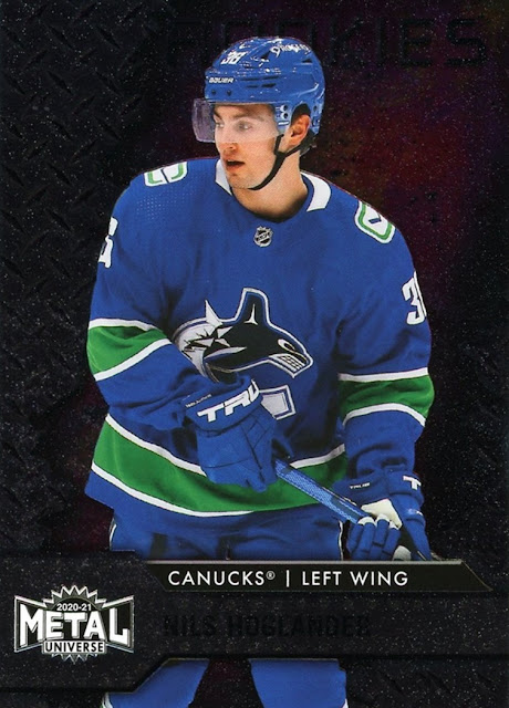
See, no etching and nothing good in the scan. Can you even tell who this is? No? It's Nils Hoglander, a rookie from last season. Even though it was last season, these cards didn't come out until this season. As I'm writing this on December 8th, we're still three weeks away from the 2021-22 cards from Upper Deck. Rookies were short printed in that you either got one rookie or one All-Star in each pack. It seems strange to me that they would have an All-Star subset in a premium set like this but I won't complain about that, I like All-Star cards. 

The design, what you can't see in the scan, is fairly lackluster, as the left side of the card is a diamond plate pattern, and the right side is images of outer space that appear to be swiped from Hubble. 

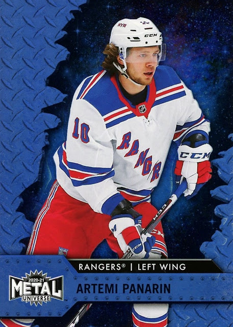
You can see them better on the blue parallel.

 This is the design, only the base cards don't have any blue. The parallels are holofoil and they are pretty nice. Much nicer than mirror foil. Still not etched though. 


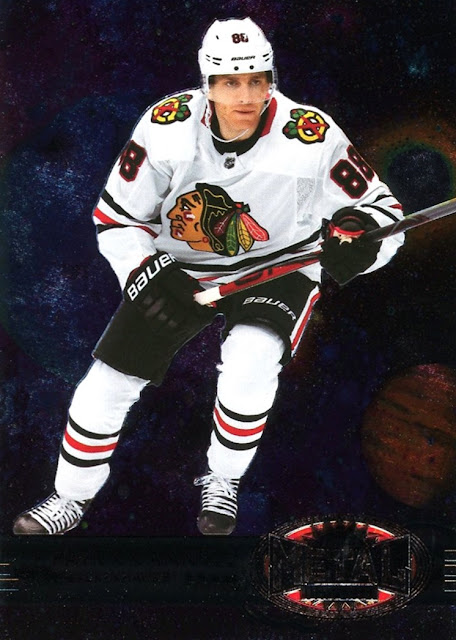
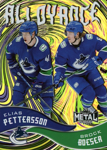
Inserts are OK...not great. Honestly, with how disappointing this set was, I think I would have been happier if the Skybox set was the base set and the Metal set was an insert, like they did with 2016-17 Fleer Showcase (where they also used mirror foil and not etched foil for the Metal insert). Yes, that last set is named "Alloyance". Upper Deck is making up words now.  I guess I should have been clued in that they would use mirror foil when the Retro insert, shown here by Patrick Kane, was the ONE year Metal didn't use etched foil but mirror in hockey.

I still have one pack to open, which I need to scan first. It left such a dissatisfaction on me that I got it back in August or September and it's now December and I still have not scanned and opened it yet. 

Honestly, I would have been happier if I hadn't spent the $50 on it. Fifty on a blaster...what was I thinking? That's what the hobby boxes should be, not a blaster. 

The Panarin parallel is by far my favorite card in the blaster. Maybe the last pack will hold something better, but that seems unlikely. 

At least I got a card post out of it, which is increasingly rare, as I focus more on the "history" portion of Cardboard History

Additional note written June 26th: I forgot about this post completely but went looking in my drafts to see if I could find something to post. As it turns out I did get something nice in the last pack, which I ended up opening back around January...

A purple spectrum parallel of Jack Hughes, which is serially numbered, and the purples look awesome. But the blue Panarin was still my favorite card of the blaster.


Friday, June 17, 2022

A visit to the US Hockey Hall of Fame

 In May, on our Epic adventure detailed in my previous post, my brother and I visited the US Hockey Hall of Fame in Eveleth, Minnesota. It was my first time visiting Minnesota and we went there specifically to go to the museum. 

When I visited the Basketball Hall of Fame, I broke that up into multiple posts and I never finished it (I still plan to when I have time) and I don't want to do that here. Instead of showing everything, which was about 1000 pictures, I'm going to share my favorites with a link to the rest. The museum is really worth visiting if you are a hockey fan of any degree, it was awesome!

The outside of the building
a small statue outside
The store


A chair set met out of hockey sticks and signed by gold medal winners


The 4th Zamboni ever built! One of my favorite artifacts in the museum. 


The scoreboard was the one used in the Mighty Ducks movie.


Quite a bit of the lower level is based on the 1980 Olympic team, aka the Miracle on Ice.


A took close up photos of each and every placque. 

A display of vintage skates, dating back to the 1880s.
Old time skate sharpener


I think these are old cards glued to the stick


My brother makes a guest appearence


This was cool but a little confusing


a building inside a building!


They have a thing set up with a radar where you can see how hard you can shoot a puck
Miracle on Ice themed Foosball, which you can play...
and Blades of Steel, which you can also play!


Along with the Zamboni, these red and blue WHA pucks were my other favorite artifacts. The WHA experimented with these pucks to see if they would show up better on TV, but it didn't pan out, and they are extremely rare. 


One large section on the top floor was on college hockey. I don't do any college sports stuff but I still photographed everything.


I opened two packs of cards in the parking lot
Then we drove to the other side of town and saw the world's largest freestanding hockey stick! 


and a 700 pound puck, too!


There's a wall of history,  but it was 30 degrees and windy so I kinda rushed through it.


There's a large representation of a Topps card on the wall
I was shivering so much I cut off the top of the word and the photo of Frank Brimsek. Ooops! 

Here's the link to my website where all the pictures are: US Hockey Hall of Fame


Thanks for reading!